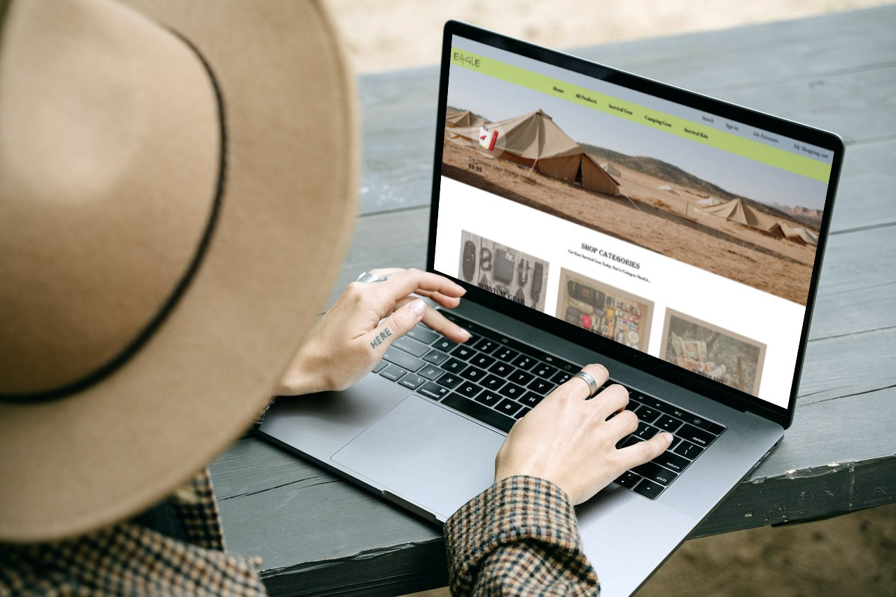
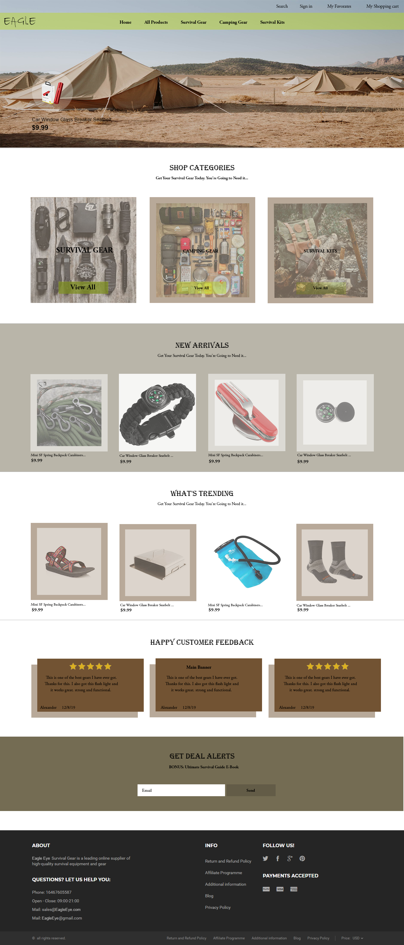
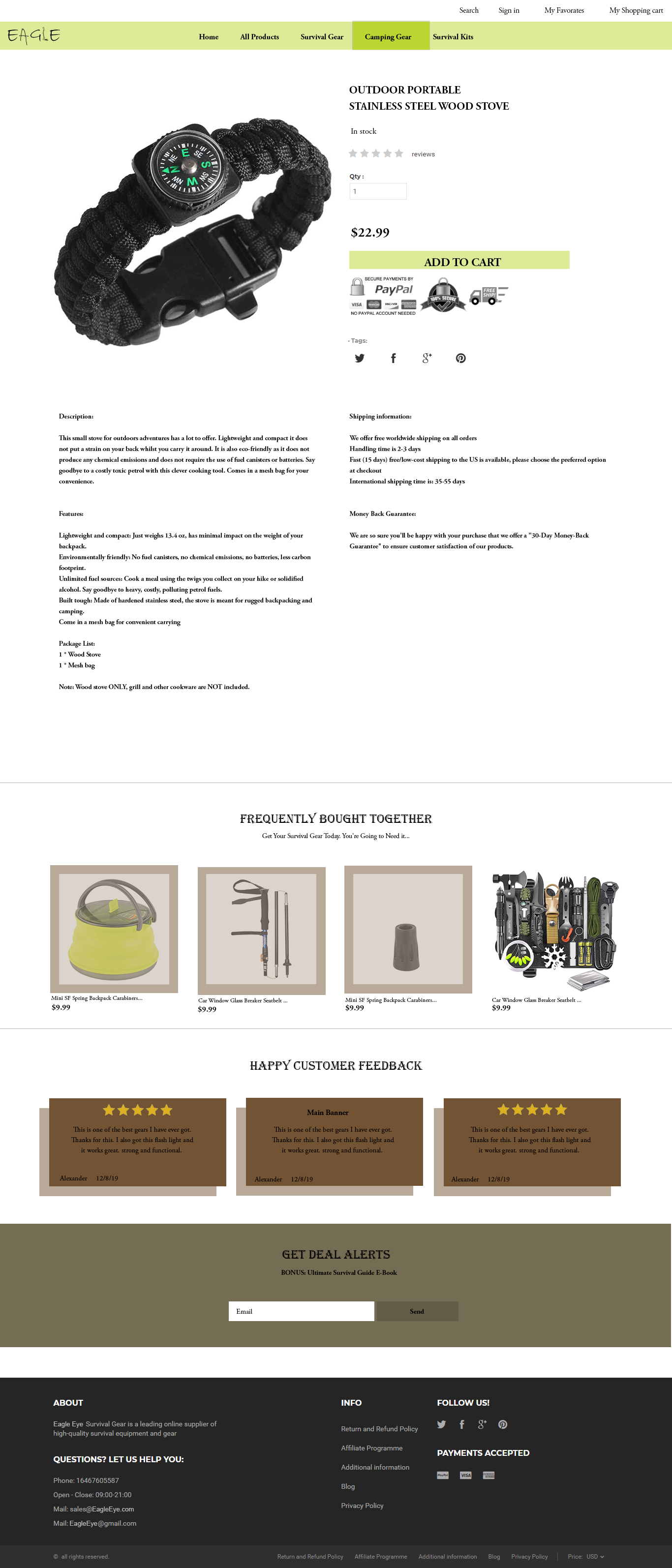
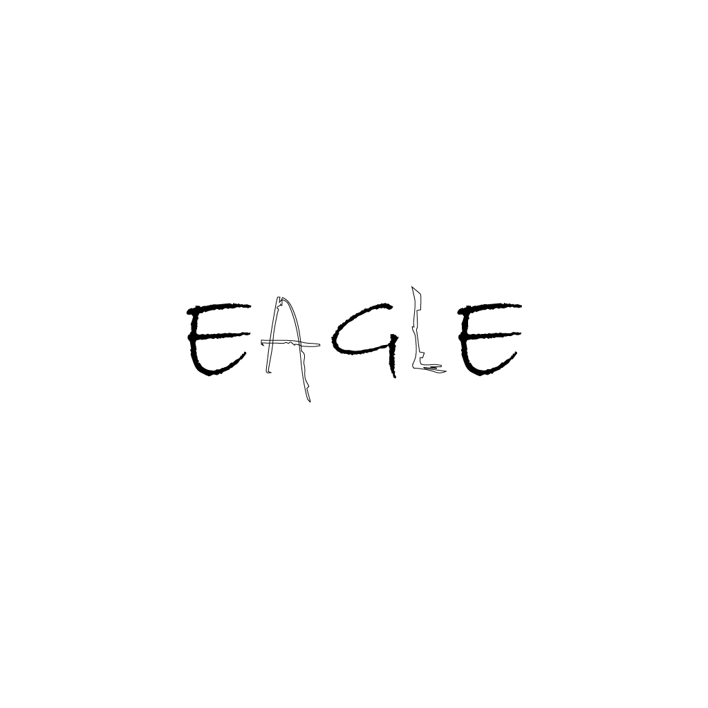
Logo
When I looked at camping gear it took me towards the survival and terrain conditions of the hikers and I decided that my logo would be made up partly of tree branches.
The font I chose was “Bradley Hand ITC” and on it I dressed the branches in letters A and L. Furthermore, I wanted to give a reminder to the eagle and decided on the letter L to wear a branch reminiscent in the shape of the eagle's leg.
The color palette I used to build the site includes brown and green shades, which are surface colors.